Creative CV
There are many ways to make your CV creative. Many look fantastic and are very original. With regards to being creative with your CV, our advice is that you should really take into account the job sector to which you’re applying before doing anything too drastic to the information on your CV. A lot of the time, if you make a very complex, creative, and interesting style for your CV then it will primarily serve to mask the key information – and the information is the most important part!
A creative CV can be very beneficial, however, for some job sectors. Graphic Design is a particular field in which a creative CV can help immediately show your skill set and your creative, innovative potential.
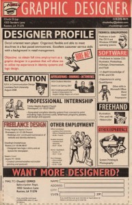
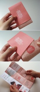
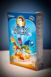
Good examples of a Creative Style CV:
The three images above are all excellent examples of the Creative CV. Firstly, we have our graphic designer on the left. His Creative CV is cleverly designed in such a way that it engages the reader with lots of different images, colours, and a clear font. It also shows the candidate’s sense of humour as it appears in the style of a Newspaper advert page. On top of all this, our graphic designer is able to fit in more content than most other types of CV.
The second CV is a folded-pamphlet. Similar to the first Creative CV, the second candidate manages to include lots of content and an image of herself, in what is a deceptively large document.
Lastly, we have the cereal box. Perhaps the most creative of all the CV’s on this page, the cereal box combines an innovative idea and beautiful aesthetics with lots of information (down the sides of the box where the ingredients usually appear).
All three combine fantastic creativity with detailed content.
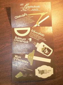
Bad examples of a Creative Style CV:
At first you might think that this creative CV is great. There’s no denying that it does look good – attractive style and nice colour-scheme. However, the page is primarily taken up by shapes and blank spaces. The information seems to be of lesser importance to the images and font-style.
It is not too difficult today, with so many stylistic online resources, to create a CV that looks beautiful. But if this is not coupled with impressive content then the former is pointless. Moreover, the font is childish which gives off the impression that you are not taking the job application seriously.
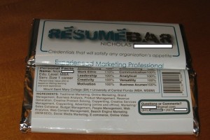
This Creative ‘Chocolate Bar’ CV is more creative than the previous bad example. However, the chocolate bar CV is bad for a number of reasons.
Firstly, although the chocolate bar CV design is eye-catching, employers will need a magnifying glass to read the content. Also, you would have to sacrifice the content and structure of a normal CV to fit everything onto the tiny space on the back of a chocolate bar!
Video CV
If applying to a creative job position, it is also worth looking into making a video CV in which you present yourself and your skill-set by creating a video, rather than writing a document. There are good and bad ways to make a Video CV.
You can find a good example of a creative video CV here. This example video shows Graeme Anthony, who wanted to find a new PR job and so made a set of interactive YouTube videos to function as a creative CV. This original idea worked and, according to him, he received offers from numerous companies. If you can show an employer that you are able to think outside the box through creativity, then definitely try to do so.
By contrast, to demonstrate how badly video CV’s can come across, ‘Don’t Be Dave’ is an example of how NOT to make a Video CV. Dave presents himself as an arrogant, incompetent individual. Of course this video is an exaggeration of what not to do, but heed the message of not being overly confident or coming across as a person that a potential employer would not want to work with.
Back to CV Templates

